Discoverability
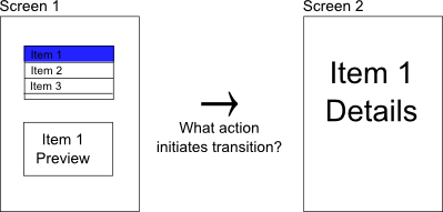
I’m working on a new iPad app (sorry, I can’t reveal yet what it is). The app is planned to have two full-screen views. The first view is fundamentally a selection view, and the second view allows interaction with the selection - in iOS terms, it is a drill-down application. Select one item from a list on the first screen, and the view changes to show the selection on the second screen.
My problem was that first screen. A full screen showing a table would be ugly - even in portrait mode. I could add images, but in a table, the images would be difficult to differentiate, and the list might be very long. After a week of brainstorming, I came up with the idea of showing a preview of the second page, or at least the relevant parts.

So now, select the item from the list and you get a preview, but how do you navigate to the second page? A button seems very out of place on iPad and a swipe gesture is difficult to find. I couldn’t help but think that there is something wrong with the HIG. Why does it seem to discourage practices that would enhance discoverability?
Then today, I came across an article by Norman and Nielsen that reiterated my sentiment. We’ve started to use “natural” interfaces where there is nothing natural, where there is no expectation. What happened to discoverability? I feel it too when, nearly every day on my Android phone, I am unsure where the back button will take me. What happened to confidence?
Designing usable UIs is more than just making use of all possible features the framework provides. It involves creativity, planning, and adhering to well-established design principles. That is something that comes from years of experience.
I eventually came up with what I think is a brilliant idea, but you will have to wait until the app is released to see it.